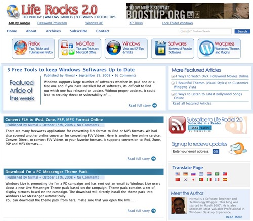
Life Rocks 2.0 has got a redesign after a gap of 10 months. The current theme was implemented in January 2008 and we thought it was time for a change. The new theme is an extended version of the current theme and optimized for faster loading. The current theme does not use any Javascript and also has lesser number of images.

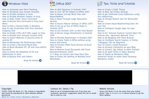
Features of the new design include better readability and navigation and also a new comment layout. Another improvement over the previous theme is having a functional footer. We have also added a breadcrumb for better navigation in all pages. Featured tips, tricks and tutorials are shown above the footer in all the pages instead of home page alone. We have also designed a new favicon for this blog.

The theme has been tested on IE8, IE7, IE6, Firefox and Opera. If you find any bugs or alignment issues, please do write them in comments.


Great new look, much more readable now, the home page also looks much better now. Just one thing link the logo to the home page 🙂
Other than another gem of a design from you 🙂
Wow looks great Nirmal. 🙂
The theme looks great. The homepage is simple and great.
Good job nirmal. It’s simple, elegent and smart.
The theme looks neat. I love the comments section now. 🙂
I feel it more readable!
Gr8 job!!
I like this design a lot better…this is more professional looking and readable….great work Nirmal…
Congrats mate. The new look is really very professional and neat. I really like it. 🙂
Hey Nirmal, I am continuously referring your theme to design my upcoming theme… and at this time you changed yours… But to be frank, older one was wonderful compared with this one, but current one is fast loading with less images. The new favicon is awesome compared with traditional LR 😎 . Breadcrumbs adds new way of navigation. jquery was one nice thing in previous one…
Comment form is far better than last one…
One important thing, the navigation bar at the top [home, archives, about….search] needs some highlight….
Removal of large number of images has made a great loading performance…
Finally, good work
simple, readable & too sexy! I wish I was a good designer as you.
A few observations:
The breadcrumb gets more attention than the top navigation bar because of the background color.
Nice to see links moved to footer, getting more space for blogads on the sidebar.
“Notify me of follow up comments via e-mail” – the checkbox and the text are aligned too distantly to feel that they are the same.
Great to see that jquery tabs are removed, giving the user what you see is what you click.
Title, meta keyword and meta description are not working as you wanted. Oh I think you are editing now also!
Google ad section start and end are not marked.
Read More link in About Author going down the background.
Regards.
Very nice and sleeky!
This is hell lot of clean and beautiful compared to the previous one. Good job!
Nirmal – Nice design, clean and less cluttered now. Sree’s review should keep you busy for some time. Keep rocking !
New design is clean and clutter free. Comment section has reallly become great now 🙂
nirmal this new theme looks good
Nice and Clean Design.
Thanks everyone for your comments and suggestions.
@Sree,
Looks like you have done a post mortem of my theme soon after the launch. 🙂
Its great to see someone really putting effort to find the bugs and issues.
1. Indeed the breadcrumb gets attention, need to fix that.
2. Notify me need to be fixed as I was not able to see that as I’m always logged in.
3. Meta and description are already in place, it was accidentally repeated in the code.
4. About adding the adsense start and end are for better keyword match I guess, will think about that.
5. Read more link looks fine for me, can you please tell me which browser you used. It worked fine in IE6,7,8 and Firefox as well.
@ Nirmal
Read More link in about me is is not looking right for me on FF2.
And why not think of making the logo clickable?
Related posts below the post are not catchy when the sponsors ad is an image and it becomes an attention grabber.
Looks awesome, and the site is loading much faster, nice work.
Looks good dude! n much much more cleaner than the previous one.. congrats!
@Pavan,
Can you send me a screenshot of the alignment of author details on the sidebar, for me it looks ok in Firefox 2 as well.
Will make the logo clickable…working on it.
This one is way better, Nirmal! Good Job!!
@ Nirmal,
This is ridiculous… It looked like Read More is a bit moved towards down [like it lies on the border of blue and white] when I checked it last time, and now everything is fixed…
@Pavan,
I got the issue, it was actually because of the font, the default font might not be available in your system. I just fixed the issue.
Thanks for the help.
Simply Awesome Theme, This new theme makes he whole blog more readable and uncluttered.i really like this theme.
1) I suggest you to keep Notify me of follow up comments via e-mail check box to left side thats the place where users have high attention.
2) its streng to see your homepage has h3 to post title, it should be h2 (SEO) and h3 for headings.
3) i would recommend to have one more Google search box after every post before comments.
4) Disable HTML in your Comments. (it really annoys when users put bold statement in comments)
@ BlogsDNA
😉
Very simple design
Nice design. You are really a good designer too.:)
Brilliant Work, Nirmal. Looks really awesome. I love the look of the comments section 😀
Wow really a cool theme……
Din’t feel like changing the Header?.. i was actually looking for a new header..
Try to highlight the menu bar.. it looks mixed with other stuff…
The language translation buttons on the sidebar.. cant you put them in a single row? Does that look nice..??
I feel the color of the footer needs to be changed a bit..??
Did you design the theme yourselves entirely or did you hire anyone?? 😉
Very nice ! This new theme is cleaner and offers better visibility. Congrats 🙂
Great job Nirmal. Sree seems to have already suggested a few changes that I thought of. The site looks elegant but maybe a little too busy with ads but not that I mind them. 🙂
Nice Theme dude. It looks more clearer and faster. Congrats 🙂
Hello Nirmal,
I love the theme 2.0 of your beautiful site.
I understand that unfortunately do not share theme 🙁
I know when the share theme 1.0?
thank you very much,
Sorry for my English
I use a translator!
High! I stumbled upon this site. My compliments, great design and nice content. I’ve added your site to my favorites, which I don’t do too often with sites I stumbled upon. Cool that you’re from Kerala. I’ve been backpacking in Kerala and the other states in Southern India in 1997. Happy memories come back 🙂
Anyhow, I like the theme. Good luck with your site and greetings from Holland.
I guess I am a bit late… Anyway Great theme man!!! Of course better then my theme 😛
Yes your new theme looks great ,everything is perfectly set and I checked your site in IE8 ,Chrome Firefox3 looks nice no problems.
New Theme is Nice Keep Rocking
Beautiful look! great job. congrat….
http://www.oxyshopping.com
I have to say, it’s a masterpiece! It really is cool, and I love the illustrations on the background, they are fabulous!
Also, I think the design is very colourful, despite the fact of a dark and white background.
Really GREAT work 😀