Techniqued- Technoloy, Review and Tutorials
  • Android
  • Freewares
  • Tutorial
  • Windows 11
  • macOS
No Result
View All Result
Techniqued- Technoloy, Review and Tutorials
  • Android
  • Freewares
  • Tutorial
  • Windows 11
  • macOS
No Result
View All Result
Techniqued- Technoloy, Review and Tutorials
No Result
View All Result

Too Much Whitespace on New Google+?

Nirmal by Nirmal
November 11, 2019
in Social Networks
0
Share on FacebookShare on Twitter

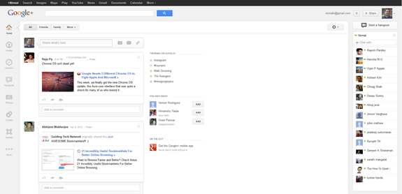
Google has rolled out a new responsive design to its social networking site Google+ which was launched last year. Unlike other Google’s social networking ventures, Google+ has been accepted well by users because of its simplicity and also absence of any ads (as of now). The service also has pretty decent features including an in built image editor and hangouts. The new design although looks very good and is also fast, there is lot of whitespace around the centre of the screen, If you are using a widescreen monitor, then probably the centre portion of the screen looks a bit weird.
Google

As you can see from the image, there is lot of space wasted at the centre portion because of the left aligned design. A lot of users had complained about this whitespace on Google+ and in fact has created a parody whitespace meme.

A few people even said that the whitespace is meant basically for chats, so when you are chatting with any friends on Google+, you can utilize this space for chat window, so that it won’t interfere with the posts. Ideally the design should have been fluid based on the screen resolution, so that for any screen resolution, the white space could have been reduced.

Now there was also a talk that the whitespace could eventually be used up for Google Adsense like it features in Gmail, but Google’ SVP was very clear that the whitespace will not be filled with ads. So we can expect some new features being added up in this section in future.

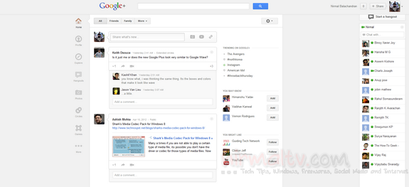
In the mean time, if you are annoyed with the whitespace, you can try this extension for Google Chrome called Whitespace Remover. The extension will center the new Google Plus design for a better fit on widescreens.
Centered design

Did you like the new Google+ design? Share your thoughts in the comments.

Tags: GoogleGoogle ChromeGoogle Chrome ExtensionGoogle PlusWhitespace
Previous Post

Disable New Timeline on Facebook with TimelineRemove

Next Post

Parental Control Software- Verity

Related Posts

Social Networks

How to Download Facebook Videos

December 25, 2021
Social Networks

How to Enable Dark Mode on Facebook (2021)

August 16, 2021
Social Networks

How to Delete Instagram Account Permanently

August 2, 2021
Social Networks

How to Send Voice Message as DM on Twitter

February 18, 2021
Social Networks

How to Install Themes on Telegram Desktop

May 2, 2020
Social Networks

How to Enable Dark Mode in Facebook New Design

March 31, 2020

Leave a Reply Cancel reply

Your email address will not be published. Required fields are marked *

This site uses Akismet to reduce spam. Learn how your comment data is processed.


Latest Articles

Tutorial

How to Enable Focus Mode in Windows 11

February 22, 2022
Reviews

Movavi Video Converter- a Versatile Video Converter with support for 180+ Formats

February 16, 2022
Windows 11

What is Reserved Storage in Windows 11

February 6, 2022
Tutorial

How to Reset Windows 11 without Losing Files

February 5, 2022
Techniqued- Technoloy, Review and Tutorials

© 2021 Techniqued - Technology, Tips, Tricks and Reviews

Navigate Site

  • About Us
  • Advertise with us
  • Contact Us
  • Copyright Policy
  • Disclaimer

Follow Us

No Result
View All Result
  • Android
  • Freewares
  • Tutorial
  • Windows 11
  • macOS

© 2021 Techniqued - Technology, Tips, Tricks and Reviews